When designing or renovating a commercial or office space, many decision-makers struggle with common issues such as:
- Rooms that feel too small or boxed-in, especially in enclosed workspaces or startup offices with limited square footage.
- Lighting that feels harsh or inconsistent, making some areas overly bright and others too dim.
- The space lacks warmth or cohesion, resulting in a sterile, impersonal environment that doesn’t support productivity or comfort.
- Zoning feels unclear, with no visual cues to distinguish collaborative areas from private or quiet zones.
While much attention is paid to lighting fixtures, wall colours, and furniture layout, an often-overlooked solution lies literally underfoot: the office carpet.
Carpet choices can have a surprising impact on how a space feels and functions. The right combination of colour, texture, and pattern can reshape how light moves through a room, influence the perception of space, and provide subtle visual guidance, all without the need for structural changes or added fixtures.
In the sections ahead, we’ll take a closer look at how strategic carpet choices can elevate both the functionality and visual appeal of your commercial space. You’ll gain insights into:
- How carpet colour affects light reflection and alters the perception of space
- The impact of texture and pattern on visual flow and spatial illusion
- Tips for choosing the best carpet for different lighting conditions—from natural daylight to overhead fluorescents
- Ways to use carpet as a tool for visual zoning and defining spatial purpose
- Answers to frequently asked questions about making the most of your carpet investment
Let’s dive into the science and strategy behind carpet choices, and how they can help you shape not just a floor, but an experience.
How Carpet Colour Interacts with Light

Before we explore how office flooring carpets can be used strategically across different office zones, it’s important to first understand how one of the most fundamental elements—colour—interacts with light.
Here’s how the right colour choice can dramatically shape the perception of space in your commercial environment:
1. Light Colours Amplify Brightness
Lighter shades like off-white, ivory, pale grey, and beige are ideal for making spaces feel more open. These colours reflect both natural and artificial light, helping to distribute brightness evenly across the room. In spaces where square footage is limited, like small meeting rooms, open-plan workstations, or internal corridors, light-coloured carpets create the illusion of airiness and movement. This reflection enhances the perception of space, making even modest areas feel larger and more inviting.
2. Dark Tones Absorb Light
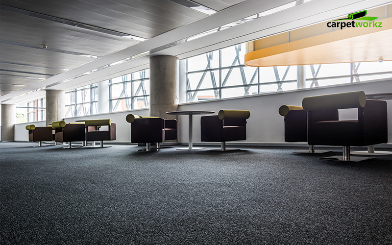
On the flip side, dark carpet colours such as navy blue, charcoal, or espresso brown tend to absorb more light. These tones visually anchor the room, adding weight and depth. While they might make a room feel smaller, they also introduce a sense of formality, warmth, and focus. In executive offices, boardrooms, or private lounges, using a darker carpet can intentionally shift the perception of space to feel more composed and enclosed, perfect for creating a grounded, distraction-free environment.
3. Mid-Tones Balance Functionality and Mood
Mid-tones like soft taupe, muted moss green, or warm greys provide a practical middle ground. They neither bounce too much light nor absorb it completely, offering a stable visual tone that works well in spaces with mixed or fluctuating lighting. These shades are often used in flexible environments, such as co-working spaces or hot-desking zones, where lighting changes throughout the day. By choosing a balanced mid-tone, you help maintain a consistent perception of space across different conditions and user activities.
4. Matching with Natural vs Artificial Lighting
Lighting source matters. Carpet colours behave differently under sunlight compared to artificial lighting. For instance, a carpet that looks warm and soft under daylight may appear stark under cool fluorescent lights. Understanding your lighting conditions is crucial, as spaces with abundant natural light can accommodate more variation in tone, while those reliant on artificial lighting benefit from warmer, more forgiving hues. This ensures that the intended perception of space holds steady throughout the day, regardless of external factors.
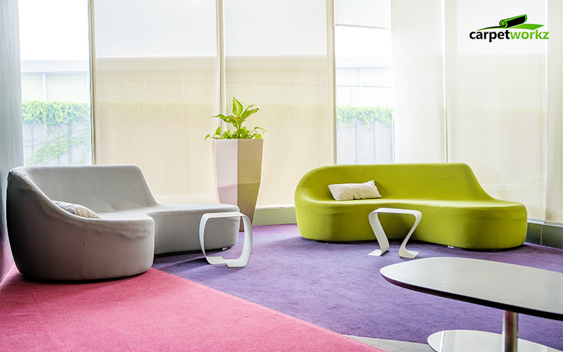
5. Contrast Can Define Areas
In open-concept offices, where space is shared and zones flow into one another, contrast can be a powerful design tool. By using darker carpets beneath desks or around collaboration zones, and lighter tones in communal walkways or reception areas, you can create visual boundaries without building physical walls. This not only enhances wayfinding but also subtly guides user behaviour, reinforcing each area’s purpose while maintaining a cohesive aesthetic.
In short, whether you’re aiming to open up a compact room, ground a large open area, or strike the right balance between light and depth, your colour choices can make a measurable difference. By understanding how different shades interact with light, you can make intentional design decisions that enhance both the functionality and the perception of space in any commercial setting.
Texture, Pattern, and the Illusion of Space
While colour sets the visual foundation, texture and pattern add depth, direction, and personality to a space. These design elements play an equally important role in shaping the perception of space, especially when used with intention in commercial environments.
1. Plush Textures Soften Shadows
High-pile or plush carpets introduce softness, not just underfoot but visually as well. These textures help absorb shadows and reduce harsh lighting contrasts, which is ideal for breakout areas, wellness rooms, or lounges. The result is a more relaxed and comfortable environment where people can decompress. Plush textures subtly influence the perception of space, making even large, open areas feel warm and inviting.
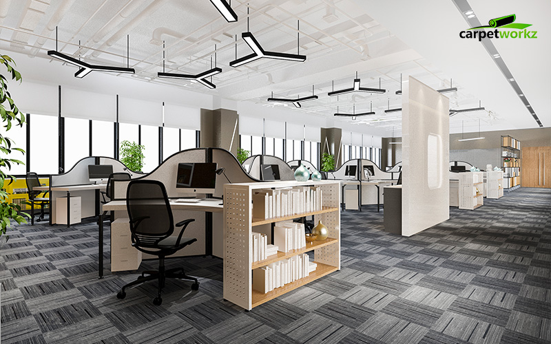
2. Directional Patterns Guide the Eye
Linear or directional patterns, such as stripes or elongated motifs, can draw the eye along a particular path. This technique is especially useful in narrow hallways or rectangular rooms. Vertical lines can visually lengthen a space, while horizontal lines can make a room feel wider. When used correctly, these patterns can make constrained layouts appear more generous and well-proportioned.
3. Subtle Gradients Create Depth
Gradual transitions in tone, such as carpets that shift from light to dark or include soft, blended hues, add a sense of layering without overwhelming the space. These gradients create visual interest and the illusion of dimension, which can be particularly effective in minimalist or modern office designs.
4. Pattern Placement Matters
Beyond the pattern itself, where and how it’s placed makes a difference. Aligning carpet patterns with architectural lines, like window frames, ceiling grids, or lighting fixtures, enhances spatial flow and prevents visual disruption. A well-placed pattern reinforces the existing structure and creates harmony within the space.
Used thoughtfully, texture and pattern can transform flooring into a powerful tool for redefining the perception of space, adding character, guiding movement, and shaping the experience of the room.
Tailoring Carpet Selection to Lighting Conditions
Now that we’ve explored how texture and pattern can shape the feel of a room, the next layer of consideration is lighting, and how your carpet choice can either enhance or disrupt that relationship. Lighting conditions vary significantly across commercial environments, and your flooring must respond accordingly to preserve both function and the desired perception of space.
1. Dimly Lit Rooms
In offices or meeting rooms with limited natural light, one of the most effective ways to open up the space is by using lighter-coloured, low-pile carpets. These materials help reflect ambient light, whether from ceiling fixtures or lamps, and distribute it more evenly across the floor. This simple adjustment can dramatically brighten the room and improve the perception of space, making it feel less confined and more welcoming.
2. Layering Light with Flooring
Lighting and flooring should work in harmony, not in isolation. Coordinating overhead lighting with carpet tones helps create balance. For instance, cooler lighting can feel stark when paired with grey flooring, but becomes more inviting when layered with warm-toned carpets. This thoughtful pairing supports a consistent perception of space, where lighting feels purposeful rather than overwhelming.
3. Avoiding Over-Illumination
Conversely, some areas, like glass-walled boardrooms or sun-drenched reception areas, suffer from too much light. Here, deep-toned carpets come into play. These richer hues help absorb excess brightness and reduce glare, preventing discomfort and visually grounding the space. This helps restore balance and maintains a comfortable perception of space even in overly lit environments.
4. Case Insight: The Lobby Scenario
Consider a corporate lobby with cool, fluorescent lighting. Without careful material choices, the space can feel sterile. By introducing a neutral, warm-toned carpet, the lighting is softened, and the perception of space shifts from clinical to professional and inviting, creating a strong first impression that aligns with the brand’s atmosphere.
Using Carpet to Reinforce Spatial Purpose
Beyond aesthetics and lighting, carpets play a quiet but strategic role in how people navigate and interact with a space. When chosen thoughtfully, they can reinforce the intended function of each area, whether it’s a collaborative hub, a focused workspace, or a relaxing breakout corner. Here’s how.
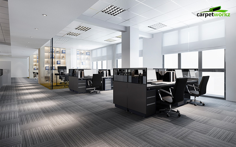
1. Create Visual Flow
In modern offices where open-plan layouts are common, creating visual continuity is essential. Seamless transitions between carpet styles, such as moving from a patterned section in a meeting zone to a solid tone in individual workspaces, can guide users intuitively through the space. These subtle shifts in design act like visual breadcrumbs, enhancing spatial organisation and reinforcing the perception of space as purposeful and well-structured.
2. Enhancing Quiet Zones
For wellness areas, reading nooks, or breakout spaces, texture and tone go a long way. Softer materials with a plush finish, combined with warm, muted hues, signal comfort and relaxation. These carpets encourage people to slow down and unwind, setting a tone that’s distinct from high-energy work zones. Even in larger rooms, this combination can carve out a mental retreat, influencing how the space is used and perceived.
3. Highlighting High-Traffic Paths
Durability is key in areas that receive heavy footfall, such as hallways, entry points, or between-desk walkways. Using darker, more robust carpets in these zones not only conceals wear and tear but also acts as a guide for movement. These visual cues support both practicality and design, making navigation effortless while maintaining the space’s rhythm and purpose.
When used with intention, carpet becomes more than flooring—it becomes a functional part of the room’s layout, subtly influencing behaviour and reinforcing the perception of space as both efficient and engaging.
Frequently Asked Questions
1. Can carpets really make a small office feel bigger?
Yes! Lighter-coloured carpets with minimal patterns can reflect more light and make a room feel more expansive. Pairing them with strategic lighting and glass partitions can visually stretch the space even further.
2. What carpet colours work best in offices with poor natural lighting?
Off-whites, light greys, and soft taupes are excellent choices. They brighten up dim areas by bouncing light around. Avoid deep, saturated colours in these spaces as they tend to absorb light and make the area feel even smaller.
3. How can I use carpet to differentiate zones without installing walls or partitions?
Use carpet tiles or changes in pattern and colour to subtly mark different zones—like meeting areas, workstations, and walkways. This visual cue helps people intuitively understand the function of each space without needing physical barriers.
Conclusion
In commercial interiors, carpet is more than just a finishing touch—it’s a powerful design element that influences how people experience a space. From the way colours reflect or absorb light to how textures and patterns guide movement, every detail contributes to the overall perception of space.
The right carpet can:
- Brighten a dim room or soften an overly harsh one
- Make small areas feel larger and large areas feel more inviting
- Define zones and support specific functions, without the need for walls
- Reinforce branding, comfort, and spatial efficiency through subtle visual cues
By understanding how carpet interacts with light, texture, and layout, businesses can make smarter choices that go beyond aesthetics, enhancing both functionality and user experience in any commercial environment.
Whether you’re redesigning a compact office or planning a large-scale workspace, your flooring matters. With so many styles, colours, and materials available, selecting the right solution doesn’t have to be overwhelming.
As one of the best office carpet suppliers in Singapore, we specialise in helping businesses choose the perfect carpet to elevate their interior and optimise the perception of space. Our team combines design expertise with practical insight to ensure your space isn’t just visually appealing, but thoughtfully designed for real-world use.
Get in touch with Carpetworkz today for tailored carpet solutions that support your goals and bring your vision to life, right from the ground up.